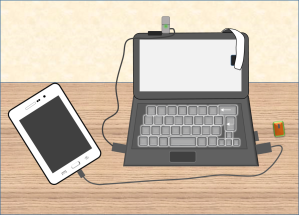
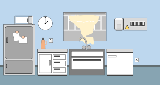
Visual design can be both fun and challenging for me and David Anderson, the e-Learning heroes challenge anchor gave me that opportunity this week to engage in a fun-filled challenge, creating a flat-design graphic image of our work-desk. The contributions this week displayed the creator’s strengths, focus and uniqueness, it’s worth checking out here.
What is flat design?
This is the kind of design where you create objects from simple basic shapes and colors. The emphasis is on being simple and not necessarily been real. Flat designs are usually most useful in building icons and cartoon-like images. Flat design can also become very useful in e-learning, particularly in training courses, safety courses or courses that involve more icons rather than real pictures.
So this is flat-design!


Concept.
A few weeks ago after I setup my work-space, I found that it was pretty complete and decided to take a snapshot. That picture happened to be just right for my flat-design and I set to work. As I completed the design, it was obvious I had so much fun creating, I wanted to do more! I went to Storyboard That, an online storyboard creator for ideas of flat design. That set me creating the design of our kitchen setup…I had to do some cleanup anyway!
Design.
Microsoft PowerPoint was my tool for this design. The design is very basic and only a combination of different shapes. Rectangles, circles, arrows, trapeziums, block arc, curve and all shapes at my disposal. Creating the window blind was a little challenging for me but I decided to use the scribble tool which I hardly use for designs generally, because it is difficult to control. One last design tool I used is the glow and bevel shape effects; this is particularly useful when designing buttons in e-Learning.
Here is a time-lapse video of how I created the kitchen work-space flat-design.
3 flat-design tips while working.
1. Group your items in batches. For example, when I finished creating the different items on my tablet, I grouped the tablet together; then grouped the keys on the keyboard, then the microphone, and mouse etc. before grouping the entire work. Movement and replacement became easier to do.
2. Zoom in to cater for details. I discovered I could add a little more detail as soon as I zoomed into that particular section. For example, to take care of the socket in the kitchen space, I needed me to zoom in.
3. Pay attention to object proportion. Whereas flat design should be fun, attention should be payed to object proportion. For example, the mouse should not be as big as the laptop itself…except of course it is deliberate to make it more fun!
Below are the photos of the above flat design for comparison.
Finally as a bonus, here is the PowerPoint file of the kitchen work-space.
Enjoy!


Great job on this Daniel! The inclusion of the video is cool and those are great tips.
Thanks Allison, for the comment… I enjoyed myself so much with this. Unfortunately, I don’t have a cat onboard!
Outstanding post and entry, Daniel! Love the video (and the music!), the before-and-after images, your PowerPoint tips and everything else. (You’re clearly quite a PowerPoint pro.) Thanks so much for sharing it all!
All thanks to God. I see great sense in my not having SL yet, I think its making me master PP, switching won’t be a problem later; besides I don’t consider myself a pro yet!
And thanks for the support Jackie.
Daniel,
Great job on this one. I really liked how you explained the process.
See you at the next challenge!
Richard
Thanks Richard…and did you notice the GO Mic? Your word was the last confirmation I needed to purchase it. I did get it eventually and my audio has improved!
Yes, till next challenge.
Love the time lapse! Very cool to see the process – usually we don’t get to see this part, only the end result. Very smart to think to include it.
Thanks Charles for stopping by to make a comment. I felt the TL would be a nice addition to the design process. I’m glad you love it!
It’s amazing to go to see this site and reading the views of all colleagues on the topic of this paragraph, while I am also keen of getting knowledge.
Thanks QJ for stopping by at my site. Yeah, we must keep learning…afterall who should lead the way in learning, shouldn’t it be e-learning designers?
The heroes community is an amazing place, with members always sharing knowledge and resources. I can’t quantify the amount of things I have learnt in the past few months I joined!
I’ve been browsing online more than 3 hours today, yet I never found
any interesting article like yours. It is pretty worth enough for me.
In my view, if all website owners and bloggers made good content
as you did, the net will be much more useful
than ever before.
Thanks for your kind words the brave one, thank God your 3 hours was not in vain eventually 🙂 There are quite a number of good blogs and sites available, it all depends on what you’re looking for at any time. Thanks again for stopping by at my blog and making a comment!